

The Moment I Knew a Standard Slide Deck Wasn't Going to Cut It
I had a conference presentation coming up — the kind where you're competing for attention against a packed agenda, a tired audience, and a room full of people quietly checking their phones. The topic was dense, the data was real, and the stakes were high enough that a forgettable deck wasn't an option.
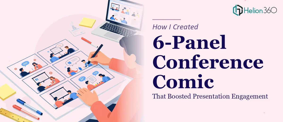
Someone on my team suggested a 6-panel comic format — a visual storytelling structure that walks an audience through a narrative arc using sequential illustrated panels, almost like a graphic novel layout built into a slide. The idea landed immediately. A conference comic presentation done well is memorable in a way that bullet-point slides simply aren't. But I knew just as quickly that doing it well was a different animal entirely.
This wasn't a weekend project. It needed to be right.
What I Discovered the Solution Actually Requires
I started pulling apart examples of what a strong 6-panel presentation comic looks like in a professional context — conference keynotes, academic visual abstracts, corporate narrative decks. What became clear fast is that this format sits at the intersection of editorial illustration, structural storytelling, and presentation design. None of those three disciplines is simple on its own.
The first signal of real complexity: each panel has to carry a specific narrative beat. This isn't decorative illustration dropped over text — the visual and the message have to be the same thing. If the panel doesn't communicate the idea without the caption, the format fails.
The second signal: visual consistency across six panels requires a controlled illustration system — character style, line weight, color palette, and perspective all locked and applied uniformly. Drift in any of those and the comic reads as amateurish rather than intentional.
The third: conference presentation comics follow conventions around reading order, panel sizing ratios, and caption placement that aren't obvious unless you've worked in the format before. Getting those wrong makes the audience work harder than they should.
What the Work Actually Involves
The foundation of a conference comic presentation is narrative architecture. Before a single panel gets illustrated, the story arc has to be mapped — problem, tension, insight, resolution — across exactly six beats. Each beat needs to be distilled to its single most communicable idea, because a panel can only hold so much. The work involves auditing the source material, identifying the six load-bearing moments, and writing panel briefs that define what each frame must convey visually and verbally. This structural work typically takes longer than people expect, and getting it wrong means the illustration work that follows is built on a shaky foundation.
Once the narrative is locked, the visual mechanics become the core challenge. A 6-panel layout needs a consistent illustration style — typically a constrained palette of 3 to 4 brand-aligned colors, a unified character or icon system, and a grid structure that respects panel hierarchy (hero panels are wider or taller than supporting beats). Caption typography follows strict rules: body captions rarely exceed 18pt, and headline callouts within panels sit at 24pt or above to create readable hierarchy at distance. Setting up a style guide that governs all six panels before a single frame is finalized is non-negotiable. Without it, each panel drifts slightly and the cohesion that makes the format powerful disappears.
Polish and consistency work is where most attempts fall apart. Applying a unified visual language across six independent panels — ensuring line weights match, shadows are rendered from the same light source, and color fills are pulled from the same hex values — requires disciplined production passes that are tedious and time-consuming. A professional illustration and presentation team runs these consistency checks as a standard step. Someone attempting this without that workflow in place will spend hours fixing drift that compounds across the panel set, and they'll often not catch all of it until the file is on screen at actual presentation size.
Why I Brought in Helion360 to Handle It
I looked at what this project actually required and made the decision quickly: I didn't have the illustration chops, the layout system, or the time to build them. More importantly, the conference date wasn't moving.
Helion360 handled the full project end-to-end — from narrative architecture and panel briefs through to the final illustrated deck ready for the stage. They turned it around in a fraction of the time it would have taken me to learn and execute it myself. The narrative mapping, the illustration system, the brand color integration, the caption hierarchy, the consistency passes — all of it was handled as a single coordinated workflow rather than a series of problems I'd be solving in sequence.
What made the engagement straightforward was that this is the kind of work they do continuously. The tooling, the style guides, the production process — it was already in place. Done in days, not weeks.
The Result and What I'd Tell Anyone Looking at the Same Problem
The six-panel comic landed exactly the way the format is supposed to. The audience tracked the narrative without effort, the panels gave people something to photograph and share, and the presentation stood out in a program full of conventional decks. Post-conference feedback specifically called out the visual format as what made the content stick.
The business outcome was straightforward: the presentation did the job it was supposed to do, and it did it better than a traditional slide approach would have.
If you're looking at a similar project — a conference presentation that needs to be genuinely memorable, in a format that requires real illustration and design discipline — and you want it handled end-to-end without burning weeks on a learning curve, Helion360 is the team I'd engage. They delivered fast and brought exactly the depth of execution this kind of work requires.