

The Situation and What Was on the Line
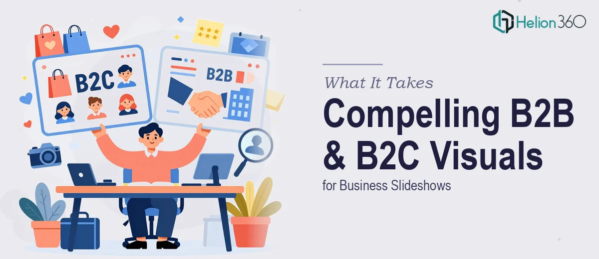
I had a business presentation coming up that needed to speak to two very different audiences at once — B2C customers and B2B clients — on the same set of slides. The ask seemed straightforward on the surface: three images that capture each segment of the customer base in a way that feels credible, on-brand, and visually cohesive.
But the stakes were real. This wasn't internal filler content. These visuals were going to anchor the narrative of an entire slideshow — the kind that gets shown to prospective partners, senior stakeholders, and decision-makers who form an impression in the first thirty seconds. Generic stock imagery wasn't going to cut it. The visuals needed to actually communicate something specific about who these customers are and why the brand serves them well.
I knew immediately this needed to be done properly, by people who understood both the visual craft and the B2B sales presentation design business communication context behind it.
What I Discovered the Work Actually Required
Once I started mapping out what a quality result would look like, the complexity surfaced fast.
First, B2C and B2B customers don't just look different — they signal different things. B2C visuals typically need to convey emotion, accessibility, and aspiration. B2B visuals need to read as professional, credible, and outcome-focused. Getting both right in a single deck, in a way that feels intentional rather than inconsistent, requires a clear visual strategy before a single image is ever created.
Second, these images have to work at multiple scales — full-bleed slide backgrounds, thumbnail previews, printed one-pagers, and potentially web assets. That means the underlying compositions, lighting decisions, and aspect ratio choices matter enormously at the concept stage. An image that looks great at full resolution can fall apart when cropped or compressed.
Third, the visuals need to carry brand weight. Colour temperature, styling, and the implied demographic of the people or scenarios depicted all feed into whether the audience reads the brand as trustworthy or generic. That's a judgment call that requires experience — not just execution skill.
The Work That Goes Into Getting This Right
The starting point for any B2B and B2C customer visual project is a clear narrative brief — an articulation of what each customer type represents to the business, what emotional or rational register the image should hit, and how the three visuals relate to each other as a set. Done well, this brief maps each image to a specific point in the presentation's story arc, so the visuals aren't decorative afterthoughts but load-bearing communication devices. Skipping this step is where most attempts fall short — images get selected or created in isolation, and the deck ends up feeling disjointed. Getting the brief right can take as long as the production itself.
From there, the visual mechanics demand real precision. Each image needs a compositional structure that allows for text overlay — typically a clear focal zone with enough visual breathing room for a headline at 36pt and a supporting line at 18-20pt without obscuring the subject. Colour grading needs to align with the brand palette (usually constrained to 3-4 core tones), and the lighting style across all three images must be consistent enough to read as a designed set rather than three unrelated assets. Any deviation in contrast range or colour temperature between images will register as a mistake to a trained eye, and often to an untrained one too.
Polish at the output stage is where the real time investment lives. Each image typically requires format variants — widescreen 16:9 for the slide, a square crop for supplementary use, and a version with reduced saturation or brightness for use as a background without competing with text. Ensuring that every export is pixel-clean, properly colour-profiled for screen display, and named and organised for a handoff that doesn't create headaches downstream is unglamorous but essential work. For someone doing this without an established production workflow, it adds hours to a project that already has moving parts.
Why I Brought Helion360 in to Handle It
I looked at what this project actually involved — the brief development, the compositional strategy, the brand-consistent production across three distinct images, and the multi-format output — and I didn't hesitate. This wasn't a task I was going to self-teach my way through in the time available, and the cost of a mediocre result was too high given the audience.
Helion360 handled the full project end-to-end. That meant taking the brief from scratch, making the strategic decisions about how to visually differentiate the B2C and B2B segments while keeping the set coherent, producing the images with the right compositional logic for slide use, and delivering clean exports across formats. They turned everything around quickly — what would have taken me weeks of trial and error was done in days, handled by a team that works on exactly this kind of problem regularly. The tooling, the visual judgment, and the production workflow were already in place.
The Result and What I'd Say to Anyone in the Same Position
What came back was a set of three visuals that felt like they belonged in the presentation — not dropped into it. Each image read clearly as either a B2C or B2B context, the colour and lighting were consistent across the set, and every slide that used them looked more authoritative as a result. The stakeholders in the room noticed. The presentation landed.
The thing I'd tell anyone looking at a similar brief is this: the moment you recognise that what a B2B sales presentation actually takes and the timeline is tight, the smart move is to stop planning to figure it out yourself. If you're in that position and need sales and marketing presentation design that actually do their job in a business slideshow, Helion360 is the team to engage — they handle this work end-to-end and deliver fast.