

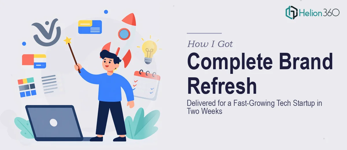
The Problem Was Bigger Than Just Outdated Slides
We were a fast-moving tech startup with a story worth telling — but our visual materials weren't telling it. The company profile looked like it had been assembled in a hurry (because it had been). The presentation slides we used to introduce our work to potential partners were inconsistent, text-heavy, and didn't reflect the caliber of what we were actually building.
The timing made it worse. We had a window of roughly two weeks before a round of external conversations that would put our brand materials in front of people whose first impression would carry real weight. Walking into those conversations with what we had wasn't an option.
I knew immediately that this wasn't a project I could patch together internally between everything else on the plate. Getting this right — the company profile, the presentation design, the brand consistency across all of it — meant engaging people who do this work professionally and at speed.
What I Found the Solution Actually Required
Before I did anything, I took time to understand what a properly executed brand refresh and company profile presentation design project actually involves. What I found made it clear this was not a weekend design sprint.
First, there's the brand audit. Before a single slide is touched, someone needs to assess what exists — logo files, color values, typography in use, tone across existing materials — and identify where things are breaking down. That alone is a structured process that requires a trained eye, not just aesthetic preference.
Second, there's the translation challenge: taking a company's actual story — what we do, who we serve, why it matters — and structuring it into a visual narrative that lands with the right audience. That's part editorial, part design, and entirely unforgiving if the logic doesn't flow.
Third, every output — the company profile, the project showcase slides, the infographics, the supporting graphics — has to feel like it came from one visual system. Achieving that across a range of deliverables simultaneously is an execution challenge that multiplies with every additional asset.
What a Project Like This Actually Takes to Execute Well
The structural and narrative work comes first, and it's where a lot of well-intentioned brand refreshes fall apart. Done properly, the process starts with a content audit — mapping what story the company is actually trying to tell, who the audience is, and what hierarchy of information needs to exist across the company profile and presentation materials. A professional presentation designer works with a defined slide architecture before touching visual layout: which sections carry which weight, where data visualizations belong, and how the narrative arc leads a viewer from introduction to conclusion without losing them. Skipping this step and jumping straight to visual design produces materials that look polished on individual slides but feel incoherent as a whole.
Visual mechanics are where the real craft lives. A properly designed company profile presentation operates on a consistent layout grid — typically a 12-column structure — with a typographic hierarchy that holds across every slide: a primary heading size, a secondary callout size, and a body size that stays disciplined even when content density changes. Color application follows a defined palette of no more than four brand colors, each with a specific role: primary, secondary, accent, and neutral. Charts and data visualizations follow their own rules — choosing between bar, line, and donut formats based on what the data is communicating, not what looks interesting. Getting these mechanics right across a full deck and a company profile simultaneously takes practitioners who work in these systems daily.
Polish and cross-asset consistency is where execution time compounds fast. Once the presentation slides are designed, the same visual language has to carry through to infographics, social media graphics, and any supporting materials — all without visual drift between assets. A designer working on these sequentially, rather than within a shared component library and master template system, will spend enormous time reconciling spacing, color accuracy, and icon style across files. Done properly, a shared master template propagates brand rules automatically, but building that infrastructure correctly from the start requires hours of setup that pays off only if the person doing it knows exactly what they're doing.
Why I Brought in Helion360 to Handle the Full Project
I didn't attempt any of this internally. Once I understood what proper execution actually required — the brand audit, the narrative architecture, the visual system, the cross-asset consistency — it was obvious that attempting it without the right tooling and experience would produce mediocre results on a blown timeline.
Helion360 handled the full project end-to-end: the company profile design, the presentation slides covering our latest projects and achievements, the data visualizations and infographics, and the brand consistency layer that tied all the assets together. They came in with the master template infrastructure already in their workflow, which meant they weren't starting from scratch on the things that take the longest.
The turnaround was fast — delivered well within the two-week window, done in a fraction of the time it would have taken to learn and execute this properly without their depth of experience. That speed wasn't rushed output; it was the result of a team that runs these projects at volume, with established processes for exactly this kind of brief.
The Result and What I'd Tell Anyone Looking at a Similar Problem
What came back was a corporate profile presentation and a full presentation suite that felt like one cohesive brand — visually consistent, narratively clear, and positioned correctly for the audience we were putting it in front of. The infographics communicated data without clutter. The slides had the kind of visual discipline that signals competence before anyone reads a single word. The brand finally matched the quality of the work we were actually doing.
The external conversations went better. Materials that represent you well create a different dynamic in the room, and that difference was visible almost immediately.
If you're looking at a similar situation — a brand that needs to catch up to the company it represents, materials that need to come together fast and cohesively — Helion360 is the team I'd engage. They handled the full scope, delivered fast, and brought the kind of execution depth this work genuinely requires.