

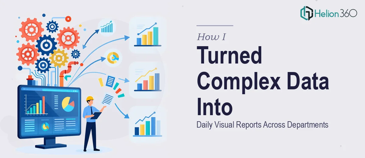
The Problem With Data That Nobody Could Actually Read
Our engineering operation was generating substantial data every single day — process metrics, throughput figures, equipment performance indicators — flowing in from multiple departments that rarely spoke the same technical language. The numbers existed. The problem was that nobody outside the engineering floor could interpret them quickly enough to act on them.
Leadership needed daily visual reports. Department heads needed clarity. And the cadence was non-negotiable — this wasn't a quarterly summary, it was a daily communication rhythm that had to hold up across teams with completely different levels of technical fluency.
I knew immediately that winging this with a rough spreadsheet and some default chart types wasn't going to work. The data was too varied, the audience was too broad, and the stakes — operational decisions made on the back of these reports — were too real. This needed to be done properly, from the ground up.
What I Found Out This Kind of Work Actually Requires
Before I made any decisions, I spent time understanding what converting complex engineering data into daily visual reports actually involves when it's done well. What I found was that the surface-level task — "make charts from the data" — massively undersells the work.
First, the source data itself is rarely report-ready. Engineering data typically arrives in formats built for recording, not communicating. Fields are inconsistently named, units vary across departments, and some metrics that look the same are actually measuring different things depending on the team that logged them. Cleaning and normalizing that input is a project on its own.
Second, the visual language has to be calibrated to a mixed audience. What communicates clearly to a process engineer will confuse a department head — and vice versa. The chart types, the level of annotation, the amount of context baked into each visual all need deliberate decisions made at the design stage, not as an afterthought.
Third, and most importantly, a daily report only has value if it's consistent. A one-off presentation is forgiving. A recurring daily output that varies in structure, terminology, or visual logic from one day to the next creates confusion instead of clarity. That consistency has to be engineered into the system, not hoped for.
What the Actual Execution Involves
The first thing proper data-to-presentation work requires is a structured audit of the source material paired with a clear narrative map for each audience. That means categorizing which metrics are operational indicators versus performance signals, deciding which data points belong in an executive summary view versus a department-level drill-down, and establishing the hierarchy of information before a single chart gets built. Practitioners typically map this across a three-tier information architecture — summary, department, detail — so that every visual has a defined role in the story rather than competing for attention on a single page.
Once the architecture is set, the visual mechanics need to be locked in with precision. A well-structured engineering report typically uses a constrained palette of no more than four data colors, a type hierarchy running roughly 28pt for headers, 18pt for labels, and 12pt for annotations, and a consistent grid so that charts across different departments align visually even when the underlying data varies in complexity. The chart-type decisions — when to use a grouped bar versus a line trend versus a summary gauge — follow from the data type and the decision the reader needs to make, not from aesthetic preference. Getting these calls right for mixed technical and non-technical audiences is where most DIY attempts break down.
The third layer is consistency infrastructure — the templating and logic that makes a daily report reproducible without degrading in quality. This involves building master slide or report templates where the data zones, label positions, and color assignments are locked to the grid and don't shift when new data populates the fields. For a daily cadence, this is the most time-intensive build phase. It requires testing the template against real data edge cases: What happens when a metric spikes far outside its normal range? What happens when a department submits incomplete data? The template has to handle these gracefully without breaking the visual structure or misleading the reader.
Why I Brought in Helion360 to Handle It
After mapping out what this work actually required, I made the call quickly. I wasn't going to spend weeks learning data visualization best practices, building templates from scratch, and debugging edge cases — not when the reports needed to start running on a daily cycle almost immediately.
Helion360 handled the full project management dashboard end-to-end. That meant the source data audit and normalization, the information architecture design across all department views, the visual system build with consistent chart types and brand-aligned styling, and the template infrastructure that made daily production reliable. They turned the whole thing around quickly — what would have taken me weeks of trial and error to get right was delivered in a fraction of that time.
The team had the tooling and the domain expertise already in place. There was no ramp-up time wasted on figuring out the approach. They came in knowing exactly what decisions needed to be made and made them well.
The Result and What I'd Tell Anyone Facing the Same Situation
What came out the other side was a report system that actually worked at a daily cadence — visually consistent, readable across technical and non-technical audiences, and structured so that department heads could scan the summary view and drill into their section without confusion. Leadership had the operational clarity they needed. Department heads stopped asking for explanations every morning. The data that had been generating noise started generating decisions.
The quality of the visual logic was immediately apparent — chart types matched the data, the hierarchy was clear, and the templates held up cleanly even when the incoming data had gaps or unusual values.
If you're looking at a similar situation — complex data, multiple audiences, a recurring reporting cadence — and you want it handled end-to-end without the learning curve, Helion360 is the team to engage. They delivered fast and brought exactly the kind of execution depth this kind of work demands.