

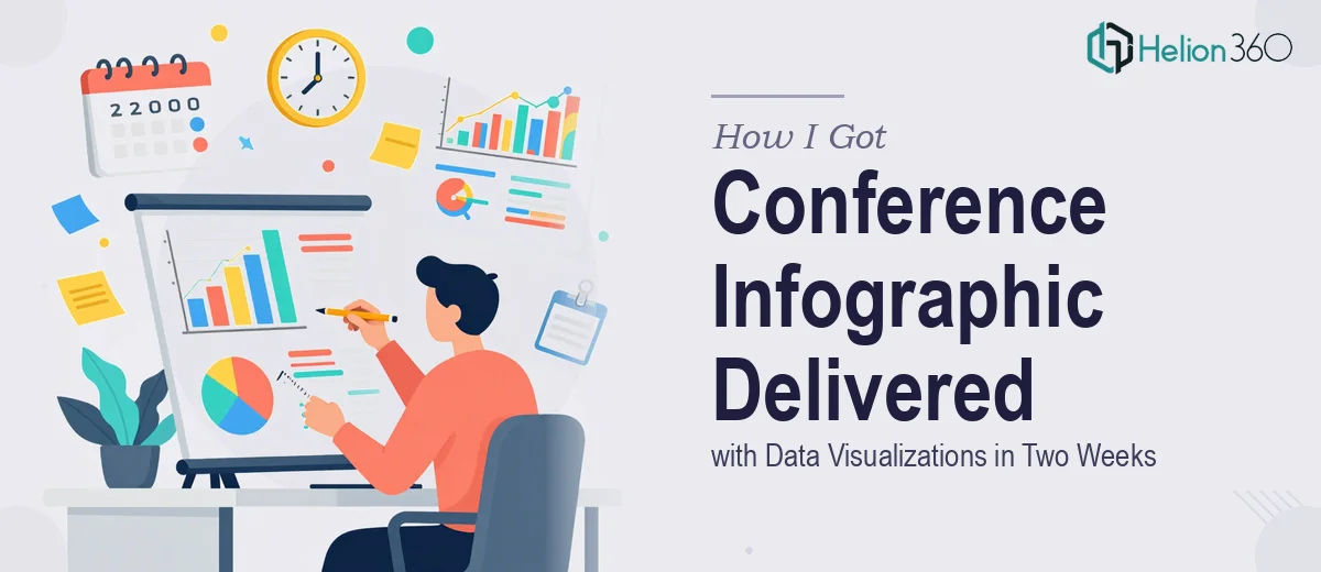
The Conference Was Approaching and the Infographic Had to Land
We had a product launch presentation coming up at a major industry conference. The deck was mostly in shape, but one piece was missing: a single, high-impact infographic that would do the heavy lifting — key statistics, product trends, adoption data, all of it distilled into something an audience could absorb in under a minute while a speaker was talking through it.
This wasn't a decorative slide. It was the anchor of the whole presentation. It needed to carry hard data clearly, look polished enough for a main-stage conference setting, and be formatted so it could drop cleanly into our PowerPoint deck without a rebuild. We had two weeks. That timeline was fixed.
I knew immediately this needed to be handled by people who do this work professionally — not because it sounded too hard, but because doing it well requires a specific set of skills that I didn't have time to develop on the fly.
What I Found Out the Moment I Started Looking Into It
My first instinct was to look at what a well-executed conference infographic actually involves. What I found fast was that the gap between a passable infographic and one that works in a live presentation setting is significant.
First, data visualization for a conference context follows different rules than a static report. Chart types have to be chosen for instant readability at distance — what reads fine on a laptop screen can collapse entirely on a projected slide. Second, layout hierarchy matters enormously. The eye has to move through the content in the intended order without the viewer needing to work for it. That's a typographic and compositional discipline, not just a visual preference. Third, the output format has to be correctly set up for slide embedding — resolution, bleed, color mode, and file type all affect whether the final asset renders cleanly or degrades on screen.
None of that is insurmountable knowledge, but it takes time to get right. Time I didn't have.
What the Work Actually Involves
The first thing a practitioner works through is the structural and narrative layer — deciding which data points belong in the infographic and in what order the story should move. With a product launch, there's always more data than space, so the work involves auditing the source material, identifying the three to five metrics that carry the most weight, and mapping a logical reading path. Done well, this stage produces a clear wireframe before any visual work begins. The friction here is that it looks deceptively simple — until someone realizes they've spent a full day reorganizing content and still don't have a clear hierarchy that holds up under scrutiny.
Visual mechanics are where the real craft shows up. Proper infographic layout uses a defined grid — typically a 12-column structure — so that charts, callout numbers, labels, and icons all align with precision rather than by eye. Typography follows a strict hierarchy: a primary stat or headline might sit at 48pt, supporting labels at 20pt, and source citations at 11pt. Chart types have to match the data: a trend line for change over time, a proportional area chart for market share, a horizontal bar for ranked comparisons. Choosing the wrong chart type is the single most common mistake in amateur infographic design, and it quietly undermines the credibility of the whole piece. Getting the grid set correctly and applying it consistently across every element takes hours, even for someone experienced.
Polish and output preparation close the loop. A conference-quality infographic runs on a tight color palette — no more than four brand colors plus one or two neutrals — applied with strict consistency across every data series, icon, and background block. Every element has to be checked at both screen resolution and projected scale, because artifacts that are invisible at 100% zoom become obvious at full-screen display. The final file needs to be delivered at 150 to 300 DPI in a format that embeds cleanly into PowerPoint or Google Slides without color shift or edge degradation. This stage alone catches people off guard — it sounds like a final checkbox, but it's a genuinely technical step that can unravel hours of good design work if handled carelessly.
Why I Brought Helion360 in to Handle It
Once I understood what proper infographic design for a conference presentation actually required, the decision was straightforward. I wasn't going to spend two weeks learning grid systems, chart selection logic, and output specifications while also managing everything else on my plate before the conference.
Helion360 handled the full project end-to-end — from reviewing our product launch data and identifying the right story structure, to building the visual layout with correct grid alignment and chart types, to delivering a final asset at the right resolution in a format that dropped cleanly into our existing slide deck. They turned it around quickly, well within the two-week window, which meant we had time for review and refinement rather than scrambling at the finish line. This is a team that handles this kind of work all day, with the process and tooling already in place — it showed in both the speed and the quality of what came back.
The Result and What I'd Tell Anyone Facing the Same Window
What we received was a clean, conference-ready infographic that made the product launch data genuinely easy to read on a projected screen. The hierarchy was clear, the chart choices made sense, the brand palette was applied consistently, and the file embedded into our deck without any rework. The presentation landed well — and the infographic was the piece that held the room's attention while the speaker moved through the key numbers.
The infographic became a reference point in follow-up conversations after the session, which told me the visual communication had done its job.
If you're looking at a similar deadline — a conference, a product launch, a presentation that needs data visualization done properly — and you want it handled end-to-end without the weeks of learning curve, consider the approach we took. What matters is engaging a team with the process and tooling already in place. For teams managing multiple deliverables in parallel, bringing in specialized infographic support can mean the difference between shipping on time and scrambling at the finish line.