

Why Your Analytics Stack Matters More Than Your Data Volume
One of the most persistent misconceptions in data work is that having more data automatically leads to better decisions. In practice, the bottleneck is almost never the volume of data — it is the absence of a coherent framework to store, process, visualize, and interpret it. Teams end up with spreadsheets scattered across drives, disconnected dashboards that nobody trusts, and Python scripts that only one person understands.
The cost of a poorly structured analytics setup compounds quickly. A dashboard built on a broken data pipeline produces outputs that look authoritative but contain silent errors. A model trained on improperly cleaned data will surface patterns that do not exist. When stakeholders lose confidence in the numbers, they stop using them — and decisions revert to instinct.
Building a comprehensive data analytics framework changes that dynamic. It means having a clear data layer, a reliable transformation layer, a visual reporting layer, and a machine learning or exploration layer — all working together in a repeatable way. The combination of SQLite, Power BI, Python, and Orange covers each of these responsibilities with tools that are accessible, well-documented, and genuinely powerful.
What a Well-Structured Analytics Framework Actually Requires
The shape of a proper analytics framework is not just a collection of tools running in parallel. It is a deliberate pipeline where each layer has a defined responsibility and a clear handoff to the next.
The data storage layer needs to be reliable, queryable, and portable. The transformation layer needs to produce clean, validated datasets that downstream tools can trust. The visualization layer needs to present information in a way that is accurate, interpretable, and appropriately segmented for different audiences. The exploration or modeling layer needs to support hypothesis testing and pattern discovery without requiring the analyst to rebuild foundational work every time.
Done well, this framework also needs to be maintainable. That means naming conventions for tables and files that any team member can follow, version control for scripts, and a documentation habit that does not rely on one person's memory. A framework that only works when a specific analyst is in the room is not a framework — it is a dependency.
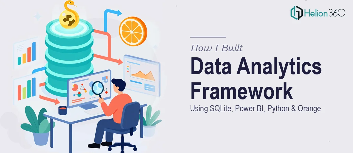
The four tools in focus here map naturally onto these layers: SQLite as the portable relational store, Python as the transformation and automation engine, Power BI as the reporting and distribution surface, and Orange as the visual machine learning and exploratory analysis environment.
How to Architect and Execute the Framework
Setting Up SQLite as the Data Foundation
SQLite is often underestimated because it is file-based and does not require a server. That is exactly what makes it valuable in a small-to-medium analytics context. A single .db file can hold gigabytes of structured data, supports full SQL syntax, and travels with the project directory without configuration overhead.
The right approach starts with a normalized schema design before any data is loaded. For a typical business analytics project, this means separating transactional tables (orders, events, sessions) from dimension tables (customers, products, regions) and establishing foreign key relationships explicitly. A table naming convention like fact_orders, dim_customers, and stg_raw_events — borrowed from data warehouse practice — makes the schema legible to anyone joining the project later.
Python's sqlite3 module or the sqlalchemy library handles the connection cleanly. A pattern that works well is writing an ingestion script that reads source CSVs from a /data/raw/ directory, applies basic type coercion and deduplication, and loads them into staging tables. From staging, a second SQL script promotes clean records into the production schema. Keeping these two steps separate means the raw data is always preserved for audit or re-ingestion.
Transforming and Cleaning Data with Python
Python's role in this framework is transformation, validation, and automation. The pandas library handles most tabular work: reshaping, merging, filtering, and computing derived fields. For date-heavy datasets, consistent parsing with pd.to_datetime() and explicit timezone handling prevents a category of silent errors that are notoriously hard to trace later.
A practical validation pattern uses pandera or simple assertion blocks to enforce expectations on each cleaned dataset before it writes back to SQLite. For example, asserting that an order_value column contains no negative numbers, or that a customer_id field has zero nulls, catches upstream data quality issues before they propagate into dashboards. Catching a broken source feed at the ingestion script is far cheaper than discovering it in a board-level report.
For recurring pipelines, a lightweight scheduler like schedule or APScheduler can run the ingestion and transformation scripts on a defined cadence — say, every morning at 06:00 — writing updated tables to the SQLite database that Power BI then reads from.
Building Dashboards in Power BI
Power BI connects to SQLite through an ODBC driver, which requires installing the SQLite ODBC connector and configuring a DSN on the reporting machine. Once connected, the Import mode pulls a snapshot of the data into Power BI's in-memory engine, which is appropriate for datasets under a few million rows. DirectQuery mode is available for larger sets but adds query latency that affects dashboard responsiveness.
The data model inside Power BI should mirror the relational structure in SQLite: fact tables connected to dimension tables via relationships, with a clearly designated date table marked as such in the model settings. DAX measures — not calculated columns — are the right vehicle for business logic. A measure like Total Revenue = SUMX(fact_orders, fact_orders[quantity] * fact_orders[unit_price]) keeps computation at query time and responds correctly to slicer context. Calculated columns, by contrast, compute at refresh time and inflate the model size unnecessarily.
For visual hierarchy, a three-level typography structure — 20pt for KPI headlines, 14pt for chart titles, 11pt for axis labels — keeps dashboards readable on both a 27-inch monitor and a shared screen in a meeting room. Color usage should follow a deliberate semantic logic: one primary accent color for the key metric, a neutral palette for secondary data, and a distinct alert color (typically a muted red) reserved exclusively for threshold breaches.
Exploratory Analysis and Modeling with Orange
Orange operates as a visual workflow canvas for machine learning and statistical exploration. It is particularly useful when the goal is to test multiple modeling approaches quickly — clustering, classification, regression — without writing model-specific code from scratch each time.
A typical Orange workflow for a business analytics project loads the cleaned dataset exported from Python (as a .csv or .xlsx from the SQLite-connected script), passes it through a Data Table widget for inspection, applies a Feature Statistics widget to identify skewed distributions or outlier-dense columns, and then branches into parallel model comparison using k-Nearest Neighbors, Random Forest, and Logistic Regression widgets connected to a common Test and Score widget. The ROC Analysis widget then surfaces which model performs best under the precision-recall tradeoff relevant to the specific problem.
Orange's value is speed of exploration, not production deployment. Once a model architecture is validated in Orange, the equivalent implementation in scikit-learn — using the same hyperparameters surfaced by Orange's tuning widgets — becomes the production artifact, version-controlled in the project repository.
What Goes Wrong When the Framework Is Under-Resourced
The most common failure mode is skipping the schema design step and loading raw CSVs directly into Power BI. This produces a reporting layer with no stable foundation — any change to the source file breaks the dashboard, and there is no queryable history to draw from.
A second frequent problem is mixing transformation logic across tools: some cleaning in Power Query, some in Python, some in DAX. When a number looks wrong, no one can trace where the discrepancy was introduced. The rule of thumb is that transformation happens once, in Python, and every downstream tool reads from a validated output.
Inconsistent date handling is responsible for more dashboard errors than almost any other single issue. If one data source stores dates as MM/DD/YYYY strings and another uses Unix timestamps, a join on those fields produces silent mismatches that distort time-series charts in ways that are not immediately obvious.
Underestimating the Power BI data model refresh cycle is another pitfall. A model with too many calculated columns and no proper date table can take 20 to 30 minutes to refresh on a modest dataset — making the dashboard effectively useless for any time-sensitive decision. Rebuilding the model with DAX measures and a clean star schema typically cuts that refresh time to under three minutes.
Finally, treating Orange outputs as production-ready without re-implementing in code introduces a reproducibility gap. Orange workflows saved as .ows files are not easily version-controlled or integrated into automated pipelines, so insights discovered in Orange should always be translated into documented Python code before they influence business decisions.
The Framework Is Learnable — and Worth Getting Right
The investment in architecting this stack properly pays dividends every time a new question can be answered in hours rather than days, and every time a stakeholder can trust a number because they know where it came from. The tools themselves — SQLite, Python, Power BI, and Orange — are each well-documented and individually learnable. The harder work is understanding how they connect and where each one's responsibility ends.
If you would rather have this framework designed and built by a team that does this kind of work every day, Helion360 is the team I would recommend.