

The Investor Meeting Was Booked and the Deck Didn't Exist Yet
When the first investor meeting landed on the calendar, I took stock of what we actually had: a product gaining real traction, a clear vision, and absolutely no presentation that could do either justice in a room full of people writing checks. This wasn't a casual update call. It was a formal pitch to early-stage investors who would be sizing us up in under thirty minutes.
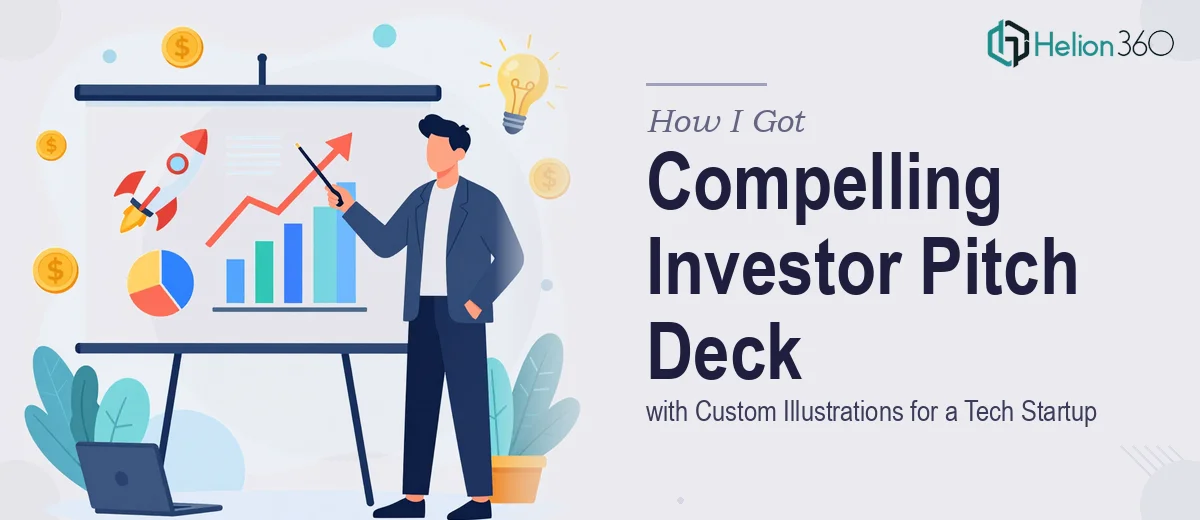
A generic slide template wasn't going to cut it. The company's brand identity was still young, and the deck needed to carry that identity visually — not just describe it in bullet points. Custom illustrations were part of the brief from the start. They weren't decorative extras. For a tech startup without a product photo library or years of brand assets to draw on, original illustration is often what makes the story feel real and the company feel considered.
I recognized quickly that this needed to be built properly, by people who do this work at a serious level.
What I Found Out This Kind of Deck Actually Requires
Before engaging anyone, I did enough research to understand what a professionally executed illustrated pitch deck actually involves. The picture that emerged was more complex than I expected.
First, the narrative structure has to come before any visual work begins. Investors follow a specific mental checklist — problem, solution, market size, traction, team, ask — and slides that don't map cleanly onto that sequence lose the room fast. Getting the story arc right isn't a design task. It's a strategic one, and it has to be solved first.
Second, custom illustration at a professional level isn't clipart swapping. It means developing a visual language that's consistent across every scene: line weight, color palette, character style, level of detail. A single illustration might take several hours to develop from concept to final execution. A deck that needs eight to twelve illustrated scenes is a significant creative production.
Third, the brand application layer adds another dimension entirely. Typography hierarchy, color use, spacing systems, and slide-to-slide consistency all have to be deliberate. For a startup without an established visual system, those decisions have to be made from scratch — and made well, because this deck is also setting the visual tone for the company going forward.
What the Work That Goes Into a Deck Like This Actually Looks Like
The narrative and structural layer is where the work starts, not where design starts. A properly built investor pitch deck begins with an audit of all the available source material — product documentation, market research, team bios, traction data — and maps it against the standard investor narrative arc. Slides are sequenced to answer the questions an investor is already forming before they're even asked out loud. Getting this right means every slide earns its place; nothing is filler. The friction here is that this kind of structural thinking requires both presentation experience and enough familiarity with investor expectations to know what lands and what doesn't. It's not a task that benefits from guesswork.
The custom illustration work operates on its own production logic. A coherent visual language for a deck means establishing a defined style upfront — flat versus isometric, outlined versus filled, character-based versus scene-based — and then executing every illustration within that system so the deck reads as a unified piece. Line weights typically stay within a 1–3pt range for consistency, and color usage maps directly to the brand palette (usually no more than four primary colors plus neutrals). Each illustrated asset needs to feel like it belongs to the same world. What trips people up is the hidden revision cycle: an illustration that looks right in isolation can feel wrong once it's placed in context with a slide layout, which means builds aren't linear.
The visual mechanics of the slides themselves — layout grids, typography hierarchy, spacing, and master slide architecture — form the third layer of execution. A properly constructed deck uses a consistent grid (typically a 12-column base) so that content elements align predictably across every slide. Type hierarchy follows a clear scale: a title might sit at 36pt, supporting headers at 24pt, and body copy no higher than 16pt. Master slides have to be built so that any future edit propagates correctly without breaking the layout. For someone not working in presentation design daily, setting up a master slide system that actually holds together — and then populating it with branded illustration and data content — is easily a multi-day production effort with significant room for consistency errors.
Why I Brought Helion360 In to Handle the Full Project
Once I understood the actual scope — narrative architecture, custom illustration production, and a full branded slide system built from scratch — it was clear this wasn't something to attempt internally on a tight timeline. The investor meeting had a fixed date. There was no runway for a learning curve.
I engaged Helion360 to handle the project end-to-end. They took ownership of the narrative structure first, mapping the story arc before a single visual was produced. The illustration development followed — a consistent visual language built specifically for the brand, not pulled from a stock library. The full slide system was built on top of that: master slides, typography, layout, and all branded assets applied with consistency across the deck.
The turnaround was fast. What would have taken weeks of learning, iteration, and revision internally was handled in days by a team that does this work continuously and has the tooling and process already in place.
The Result and What I'd Tell Anyone Looking at the Same Problem
What came back was a deck that held together as a complete piece — a clear narrative that answered investor questions in the right order, original illustrations that made the product vision tangible, and a visual system polished enough to represent the company well at the highest-stakes meetings we'd have that year. The feedback from the room was that the company looked serious and the story was easy to follow. That's exactly what the deck needed to do.
If you're looking at a similar situation — an investor pitch coming up, a brand that needs its identity expressed through original visuals, and a timeline that doesn't allow for weeks of iteration — Helion360 is the team to engage. They delivered fast, handled the full scope from narrative through final illustration, and brought the kind of execution depth this work actually requires.