

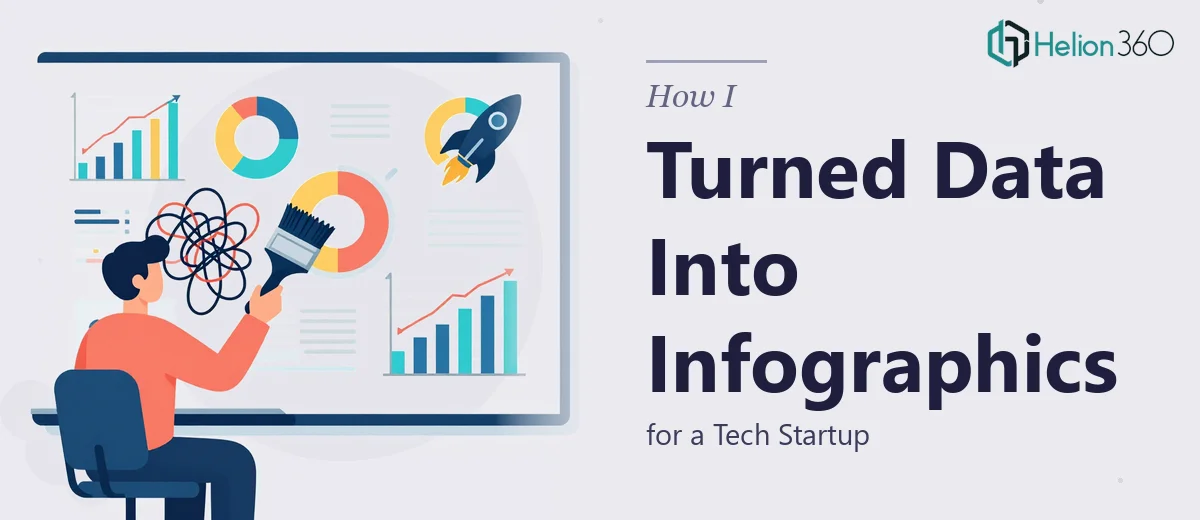
The Situation and What Was on the Line
We had an annual report presentation coming up — the kind that goes in front of potential investors and industry peers, not internal stakeholders who'll forgive a rough slide. The data was real and the story was strong, but the material was dense: financial projections, product metrics, market positioning, all of it sitting in spreadsheets and rough slide drafts that no one would sit through willingly.
The stakes were straightforward. Investors see dozens of decks. If the infographics look like they were thrown together, the data loses credibility before anyone reads a single number. This needed to look like it came from a company that had its act together — clean, structured, and visually coherent from the first slide to the last.
I knew quickly that doing this well was a different project entirely from doing it at all. The question wasn't whether we could produce something — it was whether we could produce something that would actually hold up in the room.
What I Discovered the Work Actually Required
I started researching what professional infographic design for investor presentations actually involves, and the gap between "make it look nice" and "make it communicate precisely" turned out to be significant.
The first thing that stood out was that data visualization for investor audiences isn't decorative — it's argumentative. Every chart, every icon cluster, every process flow is making a claim. Choosing the wrong chart type doesn't just look bad; it can actively mislead or confuse someone who reads data for a living.
The second thing was the volume of decisions involved. A single infographic slide can require choices about hierarchy, color encoding, icon language, label placement, and data source attribution — all of which need to be consistent across an entire deck that might span thirty or more slides.
The third signal was typography and grid discipline. Professional infographic work at this level operates on a system — not slide-by-slide styling decisions. Without that system in place from the start, the deck falls apart visually as more slides are added.
That combination — argumentative precision, high decision density, and system-level design — told me this wasn't a weekend project.
What the Work Actually Involves
The foundation of investor-ready infographic design is structural and narrative: mapping which data points belong together, what sequence best builds the investment case, and which insights need visual emphasis versus supporting text. This audit of source material — deciding what stays, what gets cut, and what gets reframed — typically precedes any design work. It requires reading the data the way an investor would, identifying the two or three numbers that anchor the story, and structuring the remaining content to support those anchors. Getting this wrong means a visually polished deck that still doesn't land — because the argument underneath it is soft.
Visual mechanics come next, and they operate on hard rules. A well-structured infographic deck uses a consistent typographic hierarchy — something like 36pt for key stats, 24pt for section headers, 16pt for body labels — so the eye always knows where to go. Chart selection follows conventions: bar charts for comparison, line charts for trend over time, dot plots or slope charts when two-point comparisons matter more than the full series. Icon systems need to be drawn from a single family and sized on a consistent grid, typically 24px or 32px, so they read as a set rather than a collection of clip art. Each of these decisions needs to be made once and applied everywhere — any drift creates visual noise that sophisticated audiences notice immediately.
Polish and brand consistency across a full deck is where execution time compounds fast. Applying a four-color brand palette with defined accent usage, ensuring all slide backgrounds share the same margin and padding rules, and checking that every data label is formatted identically takes far longer than the initial design work. A 30-slide deck with mixed chart types and varied data density will surface dozens of edge cases — a label that clips, a chart that needs a secondary axis, a callout box that breaks the grid on one slide. Resolving those edge cases systematically, without introducing new inconsistencies, is the kind of work that takes an experienced practitioner hours and a first-timer days.
Why I Brought Helion360 in to Handle the Full Project
I recognized quickly that attempting this myself wasn't realistic — not because the individual skills were impossible to learn, but because learning them to execution standard while on a live investor deadline wasn't a trade-off that made sense.
Helion360 handled the full project end-to-end: the structural audit of our source data, the design system setup, and the production of every infographic slide in the deck. They turned it around in a fraction of the time it would have taken me to work through even the first phase on my own.
What made the difference was that the expertise and tooling were already in place. The decisions about chart types, grid systems, and color encoding that would have taken me days of research and iteration were handled as a matter of course. The deck came back consistent, investor-grade, and done in days — not weeks.
What Was Delivered and What I'd Tell Anyone in the Same Position
The final presentation held together as a system — every infographic slide reading as part of the same visual language, the data hierarchy clear on every page, and the overall narrative moving in a direction that made the investment case legible without requiring narration to hold it together. It looked exactly like what it needed to look like going into that room.
If you're sitting on dense data that needs to communicate clearly to investors or senior stakeholders, and you're looking at the same gap I was — between raw material and something that actually lands — the honest answer is that the work is more involved than it appears. If you want it handled end-to-end and delivered fast, Helion360 is the team I'd engage.