

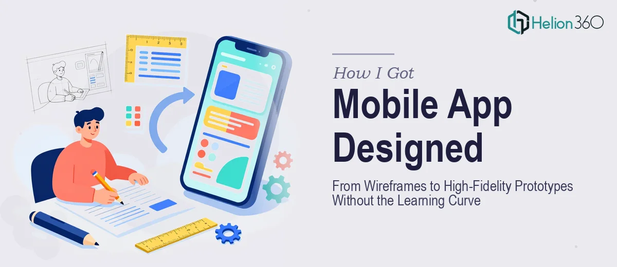
The Problem With Designing a Mobile App Interface From Scratch
We had a mobile app concept that had been living in product documents and sticky-note diagrams for months. The development team was ready to build, the product managers had mapped out the core flows, and suddenly there was a very real deadline in front of us: a working prototype needed to be in front of stakeholders within weeks, not months.
The gap between concept and clickable prototype is not a small one. Getting from a rough screen map to a polished, developer-ready UI — one that actually reflects how real users think and move through an app — requires a specific set of skills that goes well beyond knowing how to make things look attractive. I recognized quickly that this wasn't a job to be improvised or handled in spare hours. Getting mobile app UX/UI design wrong at this stage means costly rework downstream, and this project couldn't afford that.
What I Found the Solution Actually Required
I did enough research to understand what a well-executed mobile app UX/UI design process actually involves, and the scope surprised me even though I'd expected it to be complex.
The work doesn't start with visuals — it starts with structure. Before a single screen is designed, the full user journey has to be mapped: what entry points exist, where decision nodes are, how a user recovers from an error, how onboarding flows connect to core functionality. Skipping this step is exactly how teams end up with beautiful individual screens that don't work together as a coherent experience.
Then there's the tooling gap. Professional UX/UI design for mobile apps is done in tools like Figma, Adobe XD, or Sketch — not because they're trendy, but because they support component libraries, auto-layout, interactive prototyping, and handoff-ready specs that developers can actually use. Learning any one of these tools to a production level takes months of daily use. There's also the matter of platform conventions: iOS and Android each have distinct human interface guidelines governing tap target sizes, navigation patterns, and gesture behaviors. Getting these wrong produces an app that feels off even if it looks polished on the surface.
That combination of information architecture, platform expertise, and professional tooling made it clear this required a specialist.
The Work That Needs to Happen
The first phase of proper mobile app UX/UI design is structural: auditing the product requirements and mapping every screen, state, and transition before a single visual is placed. This means building a complete flow diagram that accounts for empty states, error messages, loading states, and edge cases — not just the happy path. A well-structured flow document for even a moderately complex app can cover 40 or more distinct screen states. The friction here is that this phase takes time and discipline, and teams that rush it produce wireframes with holes that only surface during development, which is the most expensive time to find them.
The second phase is visual mechanics: establishing the design system that will govern every screen. This involves defining a type scale (typically a hierarchy like 28pt/20pt/16pt/13pt for mobile), a grid system built to the 8px baseline that both iOS and Android native components respect, a color palette capped at 4 primary brand colors with defined accessible contrast ratios, and a component library of buttons, inputs, cards, and navigation elements that are reusable across every screen. Setting up a Figma component library that propagates correctly when a single element is updated — so that changing a button style fixes it across 60 screens simultaneously — is not intuitive work. It requires deep familiarity with Figma's variant and auto-layout systems, and getting it wrong means manual updates across every screen every time something changes.
The third phase is high-fidelity execution and prototype assembly: applying the visual system across every screen with pixel-level consistency, then wiring screens together into an interactive prototype that simulates real user flows. Every tap, transition, and micro-interaction needs to be specified, because developers build from what the prototype communicates. Consistency across 50-plus screens — matching padding, icon sizing, shadow depth, and corner radius values — is the kind of detail that takes experienced eyes and a checklist-driven QA pass to get right. This is where self-taught attempts tend to collapse; the individual screens look fine but the assembled prototype feels uneven.
Why I Brought in Helion360 to Handle It
Once I understood what this work actually required, the decision to bring in a specialist team was immediate. The learning curve alone — getting proficient enough in Figma's component and prototyping systems to produce developer-ready output — would have consumed more time than the entire project timeline allowed. And that's before accounting for UX judgment, platform guidelines, and the discipline required to maintain visual consistency across dozens of screens.
Helion360 handled the full project end-to-end: from the initial flow mapping and wireframe architecture through App Visual Design Services and all the way to the final high-fidelity prototype with interactive transitions. They turned it around quickly — what would have taken me weeks of learning and iteration was done in days. The team already had the component frameworks, the platform knowledge, and the QA discipline in place. There was no ramp-up time, no trial-and-error on tooling setup, just straight execution.
The Outcome and What I'd Tell Anyone in My Spot
What came back was a complete, developer-ready prototype: every screen state covered, a full Figma component library that the development team could work directly from, and interactive flows that stakeholders could click through and evaluate without any explanation needed. The feedback from the product and development teams was that the handoff was the cleanest they'd experienced on a project like this. Nothing had to be rebuilt, and the development sprint started on schedule.
If you're looking at a similar situation — a mobile app UI that needs to go from concept to high-fidelity prototype without the weeks of tooling setup and learning curve — Helion360 is the team to engage. They handled projects like AI-integrated iOS fitness apps and Instagram app integrations with the kind of depth and consistency this work requires.