

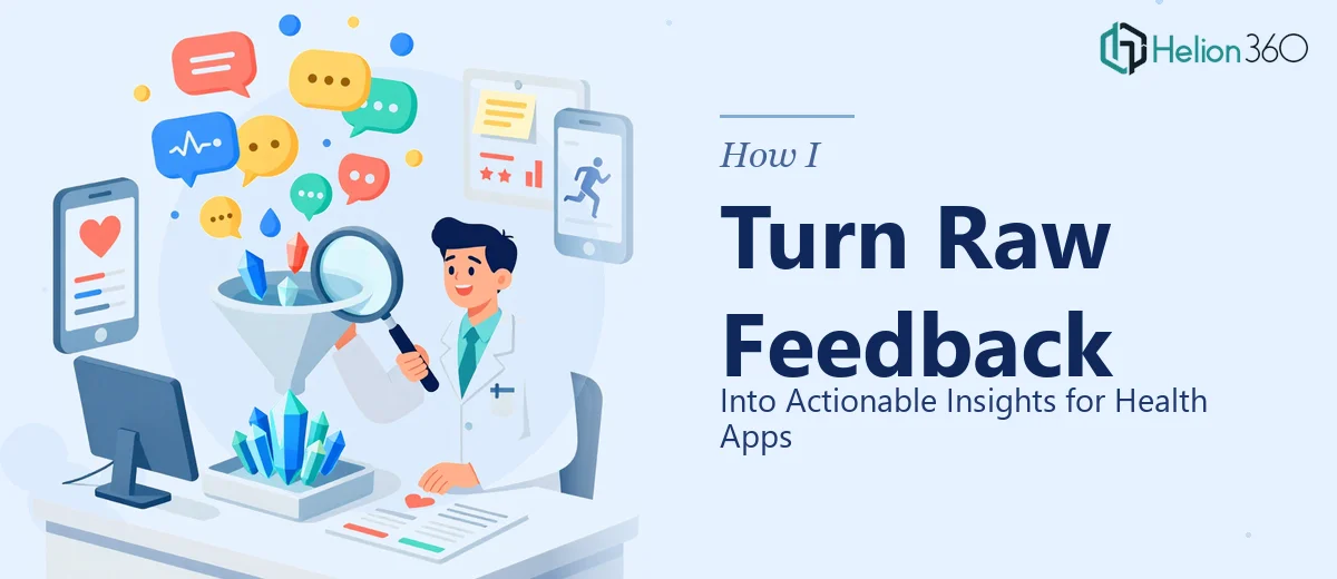
Last quarter, a health app client came to us with a spreadsheet containing over 2,000 support tickets, app store reviews, and in-app survey responses. Their product team was paralyzed. They had mountains of feedback but no clear signal on what to fix first, what features users actually loved, or why their 30-day retention was quietly bleeding out. Sound familiar?
This is one of the most common challenges I work through with health and wellness app teams. Raw user feedback is genuinely valuable — but only after you impose structure on it. Here is exactly how I approach this process at Helion 360, from messy inbox to prioritized roadmap input.
Step 1: Consolidate Every Feedback Source Into One Place
Before you analyze anything, you need to stop working in silos. Health apps typically generate feedback from at least five distinct channels:
- App store reviews (Google Play and Apple App Store)
- In-app surveys and NPS prompts
- Customer support tickets
- Social media mentions and community forums
- User interviews and usability testing sessions
I pull all of this into a single research repository. We use Notion or Airtable depending on the client, but the tool matters less than the discipline. Every piece of feedback gets a source tag, a date, and a user segment label if we have it. That segment label — whether the user is a free-tier member, a premium subscriber, or a lapsed user — turns out to be critical later.
For health apps specifically, I also flag any feedback that touches on clinical or safety language. This shapes how urgently certain issues get escalated and ensures the product team loops in the right stakeholders.
Step 2: Code the Feedback Using a Consistent Taxonomy
This is where most teams give up or take shortcuts that cost them later. Coding feedback means reading each item and tagging it with one or more thematic labels. I build a taxonomy before I start coding — not after — so I am not just pattern-matching to what I already expect to find.
A working taxonomy for a health app typically includes categories like:
- Onboarding friction — confusion during setup, goal-setting, or account creation
- Feature requests — things users wish the app could do
- Data trust and privacy concerns — especially common in health contexts
- Tracking accuracy — complaints about metrics, syncing, or wearable integrations
- Motivation and engagement — comments about streaks, reminders, and habit loops
- Accessibility — font size, contrast, screen reader compatibility
I aim to keep the taxonomy at no more than 12 top-level categories, with sub-tags where needed. If everything gets its own category, you end up with the same chaos you started with. The goal is compression without distortion.
Step 3: Quantify the Qualitative
Once everything is coded, I build a simple frequency count. How many feedback items fall under each category? What percentage of total feedback does each theme represent? This turns qualitative signals into something a product manager can actually argue from in a roadmap meeting.
But frequency alone is misleading. A theme mentioned by 30 free users might matter less than a theme mentioned by 8 premium churned users. This is why segment labels matter. I cross-tab the frequency data against user segments so the team can see not just what is being said, but who is saying it and what their value to the business is.
I also do a basic sentiment pass — not sophisticated NLP necessarily, but enough to flag whether mentions of a specific feature are predominantly frustrated, neutral, or enthusiastic. A feature mentioned frequently in positive terms is a retention asset. The same feature mentioned frequently with frustration is a churn driver. Those are completely different strategic conversations.
Step 4: Build the Insight Layer on Top of the Data
Here is where most agencies stop, and it is not enough. A spreadsheet of coded feedback is still just data. Insights require interpretation — a human making a reasoned claim about what the data means and what should happen as a result.
For each major theme I surface, I write a structured insight statement that follows this format:
- Observation: What the data shows, with a specific volume or percentage.
- Interpretation: Why this is happening, drawing on context from user interviews or product knowledge.
- Implication: What this means for the business or product strategy.
- Recommendation: A specific, testable action the team can take.
For example: Observation — 34% of negative reviews mention confusion during the first workout logging session. Interpretation — the UI assumes users already understand the app's tracking logic, which new users do not. Implication — this is a primary driver of early churn in the first seven days. Recommendation — redesign the first-time logging flow with inline contextual guidance and reduce required fields from seven to three.
That is an actionable insight. Not a data point. An insight.
Step 5: Prioritize Using an Impact-Effort Matrix
With a full set of structured insights, the last step is helping the team decide what to tackle first. I map each recommendation onto a simple two-by-two matrix: estimated user impact on one axis, estimated implementation effort on the other.
Quick wins — high impact, low effort — go to the top of the list. These are your early sprint candidates. High-impact, high-effort items go into longer-term planning. Low-impact items, regardless of effort, get deprioritized or dropped entirely, even if a vocal minority of users asked for them loudly.
For health apps, I also add a third filter: does this recommendation touch a regulated or sensitive feature? Anything related to medical claims, health data storage, or clinical integrations gets a compliance check before it moves forward, no matter where it lands on the matrix.
What This Process Actually Produces
When we completed this process for that client with the 2,000-piece feedback dump, we surfaced seven high-priority insights, three of which pointed to the same root cause: users did not trust that their health data was being handled correctly. That single theme — invisible to the team before — explained a significant portion of their churn. One targeted change to their data transparency messaging and permissions flow, informed entirely by feedback that was already sitting in their inbox, moved their 30-day retention measurably within two months.
Raw user feedback is not a burden. It is one of the most underused strategic assets a health app team has. The work is in building the system to hear it clearly.