

The Situation and What Was Actually at Stake
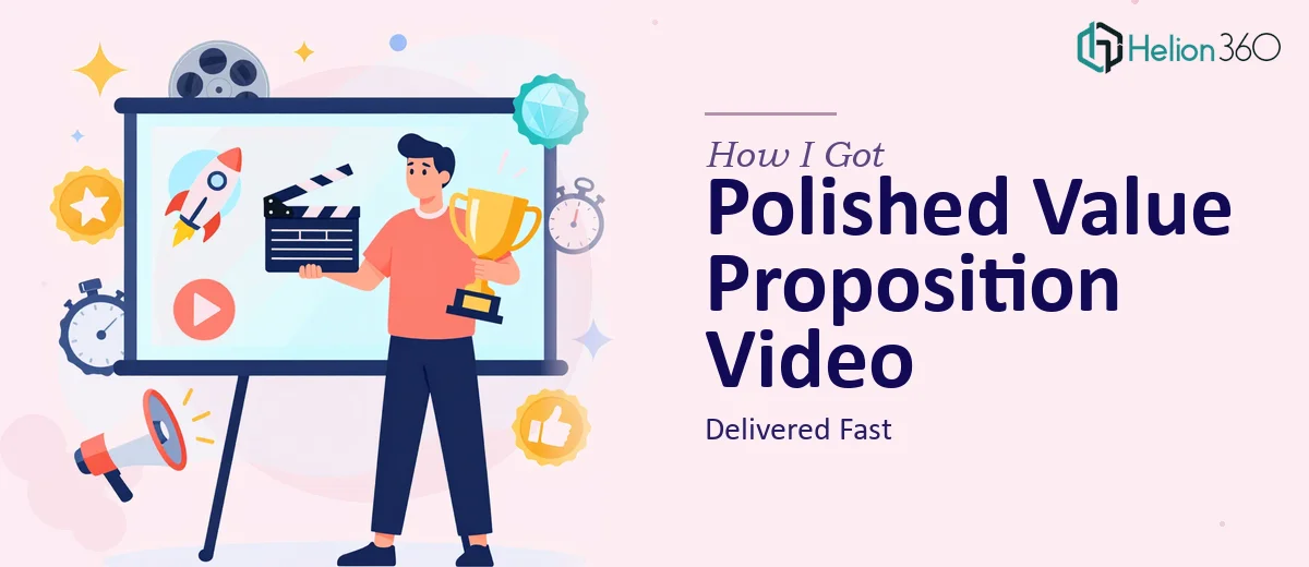
I had a clear business need: a short, punchy value proposition video presentation — roughly 60 seconds — that could communicate what we do and why it matters, with a professional voiceover and visuals that held attention from the first frame. The use case was straightforward on the surface. Drop it on a landing page, share it in sales conversations, use it as the first thing a prospect sees before a call.
But the moment I started thinking through what "done well" actually looked like — tight scripting, visual pacing, voiceover sync, brand consistency across every second of that one minute — it became obvious this was not a task to squeeze into a weekend. The stakes were real: this video would be the first impression for a lot of people. A mediocre execution would do more damage than no video at all. I knew it needed to be handled properly.
What I Found This Kind of Work Actually Requires
I spent some time researching what separates a forgettable 60-second video presentation from one that actually lands. The difference is not just production quality — it is structure, timing, and the relationship between what the viewer sees and what they hear.
A well-executed value proposition video follows a specific narrative arc: problem acknowledged in the first 8–10 seconds, solution introduced by the 20-second mark, proof or differentiation carried through the middle, and a clear, calm call to action in the final 10 seconds. Every second of that 60-second window is doing a job.
Beyond the script, the visual layer has to carry its own weight. Motion timing, type animation, scene transitions, and the pacing of voiceover against on-screen text all have to be calibrated together. Too fast and the viewer loses the message. Too slow and they drop off. Getting that balance right requires both editorial judgment and technical execution experience — two things that are genuinely hard to fake.
What the Work Actually Involves
The foundation of any effective value proposition video presentation is the script and narrative architecture. Done well, a 60-second script runs to roughly 140–160 words — tight enough that every sentence is load-bearing. The work involves auditing the core message, stripping out anything that does not serve the viewer's decision-making process, and sequencing the remaining points so each one builds naturally on the last. Getting this right is harder than it sounds. Most first drafts run long, try to say too much, or bury the actual value proposition in qualifications. The editing process alone — cutting a 300-word draft to 150 words without losing meaning — routinely takes multiple passes from someone who does this regularly.
Once the script is locked, the visual mechanics take over. Proper motion design for a presentation video relies on consistent typographic hierarchy — typically a 3-level system where headline text runs at roughly 48–54pt, supporting text at 28–32pt, and labels or callouts at 18–20pt — with animations timed to the voiceover at the word or phrase level, not the sentence level. Scene transitions need to land in the 300–500ms range to feel intentional rather than jarring. For someone building this from scratch without established motion templates, just the animation layer represents hours of work before a single frame looks finished.
Polish and brand consistency across every scene is the third dimension where execution either holds together or falls apart. A 60-second video at 24 frames per second contains 1,440 individual frames. Every one of them reflects on the brand. That means a locked color palette — typically no more than 3–4 brand colors applied with strict rules — consistent font usage, logo placement that never shifts, and icon or illustration style that does not drift between scenes. Maintaining that discipline across a fully animated piece requires a systematic approach to asset management and slide or scene master templates that most people building this ad hoc simply do not have in place.
Why I Brought in Helion360 to Handle It
I looked at what this project genuinely required — script architecture, motion design, voiceover sync, brand consistency held across 60 seconds of animation — and I recognized immediately that attempting it myself was not a realistic use of my time. The learning curve alone on the motion design side would have cost me weeks, and the output still would not have been at the level the project needed.
Helion360 handled the full project end-to-end: narrative scripting and message architecture, visual design and motion execution, and final delivery in a format ready to deploy. The turnaround was fast — done in days, not weeks — and the execution depth was evident from the first draft. They brought the templates, the motion tooling, and the editorial judgment that this kind of work requires. There was no back-and-forth on fundamentals because the fundamentals were already built into how they work.
The Outcome and What I'd Tell Anyone in My Position
What came back was a clean, professional 60-second value proposition video presentation — tight script, smooth motion, voiceover synced properly against the on-screen text, and brand treatment that held consistently from the opening frame to the close. It was immediately deployable. No additional editing pass, no round of fixes to the pacing or typography. It went straight onto the landing page and into the sales rotation.
The business outcome was exactly what I needed: a piece of content that works at the top of the funnel, communicates the core value clearly in under a minute, and looks like it was made by people who do this professionally — because it was.
If you are looking at a similar project and want it handled end-to-end without the weeks of learning curve, Helion360 is the team I would engage — they delivered fast and brought exactly the execution depth this kind of work demands.