

The Problem: A Product Concept That Needed to Look Real
I had a vending machine concept that needed to move from idea to a credible, presentation-ready format — fast. The goal wasn't just a rough sketch. The audience reviewing it would expect to see something that looked functional, realistic, and polished enough to evaluate seriously. That meant a detailed visual mock-up of the machine itself, paired with a clear narrative presentation explaining how it would work in a real-world deployment.
The stakes were straightforward: an underwhelming visual would undercut an otherwise solid concept. A vague presentation would leave the audience with questions instead of confidence. I knew this needed to be done at a level that matched the seriousness of the proposal — and that level of execution wasn't something I could pull together on my own in the time available.
What I Found the Work Actually Required
Once I started looking into what a proper vending machine mock-up and presentation actually involves, the scope became clear quickly.
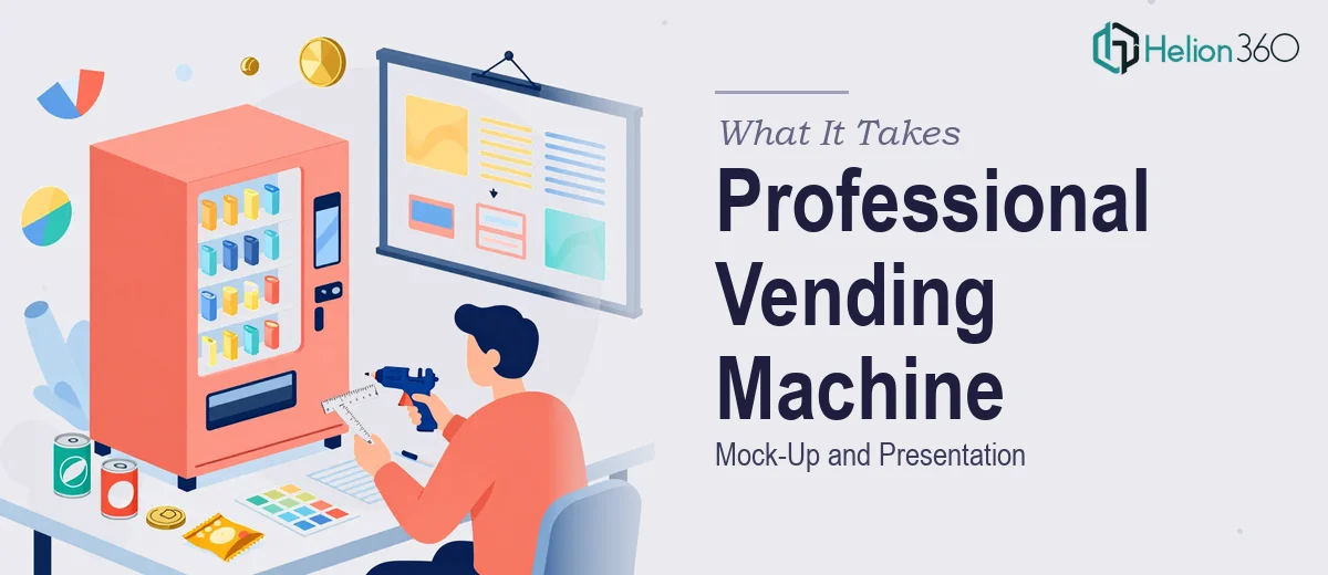
The mock-up itself isn't just a drawing. A realistic, functional-looking vending machine visual requires precise proportioning, accurate component placement — display panel, product slots, payment interface, branding zones — and enough visual depth that it reads as a real product, not a concept sketch. That means vector-based illustration work in tools like Adobe Illustrator, with careful attention to perspective, lighting cues, and material textures.
The presentation layer adds a second dimension entirely. It needs to translate the visual into a story: what the machine does, how a user interacts with it, where it fits operationally. That's a structural and narrative challenge on top of the design challenge. Two distinct skill sets, running in parallel, both needing to meet a professional standard. That's when I stopped thinking about doing it myself and started thinking about who handles this work well.
The Work That Needs to Happen
The foundation of a vending machine mock-up is the vector illustration itself. Done properly, the machine is built on accurate proportions — typical units run roughly 72 inches tall by 38 inches wide — with each component zone (product grid, touchscreen or button panel, coin and card interface, branding header) sized and positioned to reflect real engineering constraints. The illustration work uses layered vector paths to create material separation: metal chassis, glass front panel, internal lighting. Getting this right in Adobe Illustrator or a comparable tool requires strong technical drawing ability, and a single detailed machine view can take many hours to construct without a pre-established asset library.
The user experience narrative layer sits on top of the visual and has its own discipline. A proper presentation of how a vending machine works in a real-world scenario doesn't just describe steps — it maps a user journey: approach, product selection, payment, dispensing, and any edge cases like out-of-stock handling or payment failure. Each stage needs to be communicated visually and textually across slides, using a consistent layout grid and a type hierarchy (typically 36pt headline, 24pt subhead, 16pt body) that keeps each slide readable without crowding. Structuring this arc so it flows logically and lands cleanly takes content editing judgment that's separate from the illustration skill.
Visual consistency across the full deliverable is the third pressure point. The mock-up illustration, the presentation slides, and any supporting diagrams all need to share a single visual language — matching color palette (ideally no more than 4 brand-aligned colors), consistent icon style, and unified typography. In practice, maintaining that coherence across a multi-slide deck that also incorporates a detailed custom illustration is where self-directed attempts tend to break down. Inconsistencies in line weight, color application, or font usage across slides signal an amateur hand immediately to a discerning audience.
Why I Brought in Helion360 to Handle It
I recognized early that this project combined two demanding workstreams — detailed product illustration and structured presentation design — and that doing either one well would take significant time and specialized tooling. Attempting both myself wasn't a realistic option.
Helion360 handled the full project end-to-end. That meant taking the reference image and concept brief, producing the detailed vending machine mock-up to a professional illustration standard, and building the presentation around it with a clear user-experience narrative and consistent visual design throughout. The turnaround was fast — done in days, not weeks — and the execution depth reflected a team that does this kind of work regularly, with the software proficiency and design systems already in place.
What I didn't have to do was spend days learning vector illustration techniques, figure out how to structure a product concept narrative from scratch, or iterate through rounds of inconsistency fixes. The brief went in, the finished deliverable came back, and it was at the level the audience expected.
What the Project Delivered — and What I'd Tell Anyone in the Same Spot
The result was a professional vending machine mock-up that accurately represented the concept's physical form and user interface, paired with a clean presentation that walked the audience through real-world deployment clearly and confidently. The visual and narrative worked together as a single coherent package — not two separate pieces stitched together.
Anyone looking at a similar brief — a product concept that needs both a realistic visual representation and a professional presentation around it — will run into the same two-track complexity I did. The illustration work alone is a serious technical undertaking. Combined with structured presentation design, it's a full project. If you're in that position and need it handled properly and quickly, Helion360 is the team to engage — they delivered end-to-end, fast, and at a standard that held up in front of a real audience.