

Why Getting a Logo Right Matters More Than Most People Expect
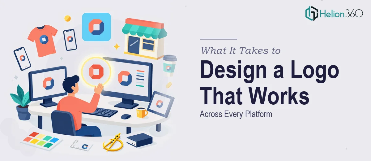
A logo is often the first thing someone sees when they encounter a brand. It appears on a website header, a product label, a business card, a trade show banner, and sometimes a 16x16 pixel browser tab — all in the same week. That range of contexts is what makes logo design genuinely hard, and what separates a mark that holds up from one that looks fine on a mood board but breaks down everywhere else.
For an eco-friendly or sustainability-focused brand, the stakes are even higher. Audiences in this space tend to be visually literate and skeptical of greenwashing. A logo that feels generic, overly literal, or poorly constructed will undermine the credibility that the brand is trying to build. Done well, a professional logo design carries the brand's values without spelling them out — and works just as cleanly at 400 pixels as it does embossed on a tote bag.
The gap between a logo that looks acceptable and one that functions professionally across digital, print, and merchandise is where most of the real work lives.
What Professional Logo Design Actually Involves
Logo design is not just illustration. It is a structured problem-solving process that starts with brand strategy and ends with a rigorously tested set of files. The difference between good execution and rushed execution shows up in four specific areas.
First, the concept has to be grounded in the brand's actual positioning — not just aesthetic preference. For a sustainable products company, that means understanding whether the brand is premium and minimal, approachable and community-driven, or scientific and credible, because each positioning calls for a completely different visual direction even if the color palette is similar.
Second, the mark itself needs to be constructed with precision. Professional logos are built in vector format from the start, with anchor points placed deliberately and shapes that remain clean at any scale.
Third, the color system has to be defined completely — not just a hex code, but the full set of Pantone, CMYK, RGB, and HEX values needed for consistent reproduction across every medium. A green that looks right on screen can drift badly in offset print if the CMYK values are not calibrated correctly.
Fourth, the deliverable set needs to account for every real-world use case, including light backgrounds, dark backgrounds, single-color versions, and reversed white applications.
How the Work Gets Done: From Brief to Final File Set
Defining the Visual Direction Before Touching Software
The most reliable approach to logo design starts with a structured brief and a competitive audit before any concept sketching begins. The brief should capture the brand's personality as a set of adjectives — grounded, modern, optimistic, and trustworthy, for example — and translate those into visual references through a mood board. For a sustainability-focused brand, the mood board typically distinguishes between directions: earthy and organic (rounded forms, warm greens, textured feels), clean and technical (geometric shapes, cooler greens, precise spacing), and expressive and activist (bold type, high contrast, impactful iconography).
The competitive audit matters because it reveals what conventions the category uses and where differentiation is possible. If every competitor in the eco-friendly space is using a leaf or a tree, that is useful information — it tells you that the category cue is already saturated, and a more abstract or typographic approach may stand out more effectively.
Constructing the Mark in Vector
All serious logo work happens in a vector environment — Adobe Illustrator being the industry standard. The reasoning is straightforward: a vector file scales from a 1-inch label to a 10-foot billboard without any loss of quality because the shapes are defined mathematically, not as pixels.
For an eco-friendly brand aiming for a clean, modern look, the construction typically starts with geometric primitives — circles, rectangles, arcs — and then modifies them through careful use of the Pathfinder panel and pen tool adjustments. A common approach is to build the primary icon on a grid where the canvas is divided into units of, say, 10 or 16, and every element snaps to those units. This creates proportional relationships that read as intentional and polished even when viewers cannot consciously identify why.
Typography in a logo is usually set using an established typeface as a base and then customized — adjusted letter spacing, modified letterforms, refined curves — so the logotype feels distinct rather than generic. For a brand in the sustainability space, a humanist sans-serif like a Gill Sans derivative or a geometric sans with slightly softened terminals tends to balance modernity with approachability better than a hard geometric face.
Building the Color System and File Set
Color is where logo design becomes technical in ways that most people underestimate. Green is not one color — it is hundreds of colors across different color spaces, and each has different behavior depending on medium. A typical professional color specification for a primary brand green might read: Pantone 7737 C, CMYK 62/0/85/5, RGB 98/178/80, HEX #62B250. Each value is needed for a different context: Pantone for branded merchandise and specialty print, CMYK for offset and digital print, RGB for screens, HEX for web and digital applications.
Beyond the primary green, a complete eco-friendly brand palette typically includes one or two earthy neutrals — a warm off-white and a deep brown or charcoal — and a secondary accent color that provides contrast without competing with the primary. The discipline of capping the working palette at four colors (primary green, secondary neutral, dark anchor, and light background) keeps the system flexible without becoming chaotic.
The final file set for a professional logo includes the primary full-color version, a one-color black version, a one-color white version (reversed), a grayscale version, and in many cases a simplified or icon-only version for small applications like app icons and embroidery. File formats include AI (master vector), EPS (for print vendors), SVG (for web), PDF (for sharing), and PNG exports at 1x, 2x, and 3x resolution for digital use.
What Goes Wrong When Logo Design Is Rushed or Underspecified
One of the most common failure modes is starting with aesthetics instead of strategy. A designer who jumps straight into visual concepts without a proper brief often produces something that looks attractive in isolation but does not actually represent the brand's positioning — and the client only realizes this after the logo is already in use.
Another frequent problem is delivering a raster file instead of a true vector master. A logo saved as a high-resolution PNG or JPEG looks fine on screen but cannot be scaled for large-format print without degrading. Many logos get used for years before someone tries to put them on a banner and discovers the source file does not actually exist in a usable format.
Color drift is a third major issue. When a logo is reproduced across different vendors — a print shop, a merchandise supplier, a web developer — without a complete color specification document, each party makes their own interpretation. The result is a brand green that is slightly different in every context, which erodes brand consistency faster than most people expect. Even a 10-point shift in CMYK values can produce a noticeably different green under print conditions.
Underestimating the version set is also common. A logo designed only in its full-color horizontal lockup will fail when it needs to appear as a square app icon, be embroidered on a cap (which requires a simplified form with no gradients), or print in a single-color environment like a rubber stamp or a fax header.
Finally, skipping the scalability test — which means viewing the logo at 16px, 32px, 64px, and 512px side by side before finalizing — is a mistake that shows up immediately in real-world use. Fine details that look elegant at full size become noise at small sizes, and what reads as a leaf or a letter at large scale can become an unrecognizable blob at favicon dimensions.
The Fundamentals That Make a Logo Last
A logo that works is one that was designed with constraints in mind from the beginning — constraints of color, scale, medium, and reproduction method. The mark needs to carry the brand's meaning without relying on color alone, because it will be reproduced in black and white. It needs to read clearly at 16 pixels, because it will live in browser tabs. It needs to survive embroidery, because the brand will eventually put it on a shirt.
Those requirements are not afterthoughts — they are the design brief. Starting with them, rather than arriving at them late, is what separates logo design that holds up over years from work that needs to be redone every time the brand grows into a new context.
If you would rather have this handled by a team that does this work every day, Helion360 is the team I would recommend.