15Jul
How to Turn Quarterly Sales Data Into Actionable Visual Charts
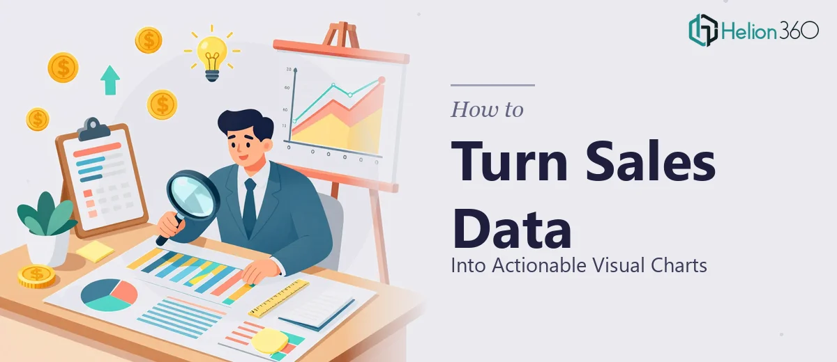
Learn how to transform complex quarterly sales data into clear, actionable financial infographics and visual charts that communicate results effectively.
Read More

Presentation design, digital marketing & market research for businesses worldwide.
Loading blog…
Learn how to transform complex quarterly sales data into clear, actionable financial infographics and visual charts that communicate results effectively.
Read More
Learn how to plan and produce a high-quality motion graphics video with stock imagery — from visual theme to transitions, typography, and color system.
Read More
Learn how to build a dynamic KPI scorecard in Excel to track employee performance with real formulas, layout rules, and common pitfalls to avoid.
Read More
Learn how to build advanced Excel dashboards that surface regulatory and market research insights quickly, even under demanding deadlines and complex data.
Read More
Learn how to structure, visualize, and present AI research findings in a way that meets academic standards and communicates clearly to any audience.
Read More
Learn how to build a cohesive visual brand identity from scratch — logo, color system, typography, and guidelines that hold together across every channel.
Read More
Learn how to build a structured e-commerce product catalog with original descriptions, clean Excel data, and a workflow that scales beyond 60 SKUs.
Read More
Learn how to build a compensation analysis Excel spreadsheet that clearly communicates employee benefits, pay structure, and total rewards to your workforce.
Read More
Learn how to manage complex data comparisons across multiple Excel sheets with the right formulas, structure, and approach to avoid costly errors.
Read More
Learn how to identify, diagnose, and fix data discrepancies between two Excel spreadsheets in an e-commerce context — with real formulas and techniques.
Read More