

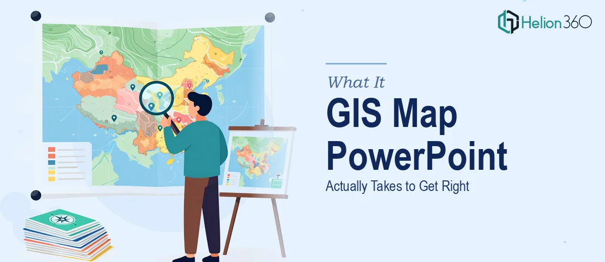
The Presentation Had to Do More Than Show a Map
I was staring at a project that needed a polished PowerPoint presentation built around GIS mapping data. The audience wasn't a group of casual viewers — they were technically literate, analytically minded, and fully capable of spotting a slide deck that had been slapped together. The presentation needed to walk through GIS fundamentals, showcase a real project walkthrough using actual spatial data, and close with something that stuck. Not just informative — visually compelling and logically structured from start to finish.
The stakes were real. A weak presentation would undercut the credibility of the underlying work, regardless of how strong the analysis was. I could see pretty quickly that this wasn't something to attempt with a template and a weekend afternoon. It needed to be done right, and that meant understanding what doing it well actually required.
What I Found the Solution Actually Required
Once I started mapping out what a strong GIS map presentation actually involves, the complexity became clear fast.
The first signal was the data translation challenge. GIS outputs — shapefiles, raster layers, spatial queries — don't drop neatly into PowerPoint slides. Turning spatial data into presentation-ready visuals requires deliberate decisions about what to show, at what zoom level, with what annotation, and in what sequence. Each map frame needs to tell a specific part of the story, not just display data.
The second signal was narrative architecture. A GIS presentation that moves from fundamentals to a live project walkthrough to a conclusion isn't just a sequence of slides — it's a structured argument. Each section has to earn the next. If the intro runs too long or the project walkthrough loses the thread, the audience disconnects before the conclusion lands.
The third signal was the visual design standard expected for this kind of content. Spatial data visualizations have their own conventions — color ramps, legend placement, scale bars, projection callouts — and violating them signals unfamiliarity with the subject matter. That's a credibility problem, not just an aesthetic one.
The Work That Needs to Happen
The structural work starts with a content audit and story map. A well-built GIS presentation follows a logical arc: establish what GIS is and why it matters, demonstrate it through a specific project with real spatial decisions visible on screen, and close with implications that resonate beyond the data. Mapping that arc before touching a single slide is non-negotiable. Practitioners typically plan this as a three-act flow — context, evidence, impact — with each slide assigned a single primary message. Getting this wrong means slides that feel random even if the content is technically accurate, and no amount of visual polish fixes a broken narrative.
The visual mechanics of GIS-specific slides carry their own set of requirements. Map slides need spatial context that's legible at presentation resolution — typically 1920×1080px — with color schemes that don't fight the underlying cartographic data. A four-color maximum palette applied consistently across non-map slides, combined with a strict 36pt/24pt/16pt typographic hierarchy, keeps the deck readable without visually competing with the map content. The real friction here is that GIS-sourced images often arrive at inconsistent resolutions and aspect ratios, requiring manual cropping and reframing for every single slide. That process is tedious and unforgiving — one misaligned map frame breaks the visual rhythm of the whole deck.
Polish and consistency across all slides is where most self-built presentations fall apart. Consistent use of a 12-column grid, uniform icon sizing, and precisely matched annotation styles across a 20-plus-slide deck requires slide master discipline that takes hours to set up correctly for someone who doesn't work in PowerPoint professionally. Interactive elements — clickable map zones, hyperlinked resources, layered animations that reveal spatial data progressively — add another layer of build time on top of static design. Each interactive element needs to be tested across view modes and export formats, and edge cases multiply quickly when maps and animations are combined in the same slide.
Why I Brought in Helion360 to Handle It
I recognized immediately that attempting this myself wasn't a realistic use of my time. The combination of spatial data translation, narrative architecture, and design precision required the kind of depth that only comes from doing this type of work repeatedly — with the tooling already configured and the judgment already calibrated.
Helion360 handled the full project end-to-end. That meant taking the raw GIS outputs and project documentation, structuring the narrative arc from fundamentals through the project walkthrough to the closing impact section, and building every slide to the visual standard the audience expected. They turned it around quickly — done in days, not the weeks it would have taken me to work through the learning curve on spatial data formatting alone.
What made the difference wasn't just speed. It was knowing that every design decision — color ramp selection, legend placement, animation sequencing, slide master setup — was being made by a team that handles this kind of presentation work all day, with the expertise and tooling already in place.
The Result and What I'd Tell Anyone in My Spot
The delivered deck held together as a complete, coherent presentation. The GIS fundamentals section gave the audience the grounding they needed without running long. The project walkthrough used map frames that were legible, annotated cleanly, and sequenced in a way that made the spatial logic easy to follow. The conclusion gave the audience something to take away beyond the data itself. It looked and felt like a professionally produced presentation — because it was.
The underlying GIS work was strong. The presentation matched that standard instead of undermining it, which is what was at stake from the beginning.
If you're looking at a similar project — spatial data that needs to become a presentation, a technical audience that will notice the difference, and a deadline that doesn't leave room for trial and error — Helion360 is the team to engage. They deliver fast and handle the full execution depth this kind of work demands.